
Do your marketing posters struggle to capture measurable engagement? Static designs leave valuable leads behind when viewers have no clear path from print to digital action. This guide covers sizing, placement, contrast, and code type so every poster you print becomes a trackable digital touchpoint.
Bridging the Gap Between Print and Digital
Posters have served as essential marketing tools for decades, yet they often suffer from limited space and lack of interactivity. Integrating a QR code transforms a static design into a gateway for multimedia content. By scanning a code, viewers can instantly access event promos, digital menus, or coupon codes without the friction of typing a URL.
This approach also supports cleaner layouts. Instead of crowding the poster with paragraphs of text, you can focus on a compelling hero image and a brief message. Understanding how QR codes connect print and digital marketing helps you decide what content sits on the poster versus what lives behind the scan – videos, landing pages, or downloadable offers that would never fit in print.
Sizing for Visibility and Scanning Distance
The most critical factor in poster QR code success is the relationship between the physical size of the code and the distance of the viewer. If a code is too small, the smartphone camera cannot resolve the individual modules, and the scan fails. For materials scanned at arm’s length, the minimum QR code size should be no smaller than 2 × 2 cm (0.8 × 0.8 inches).
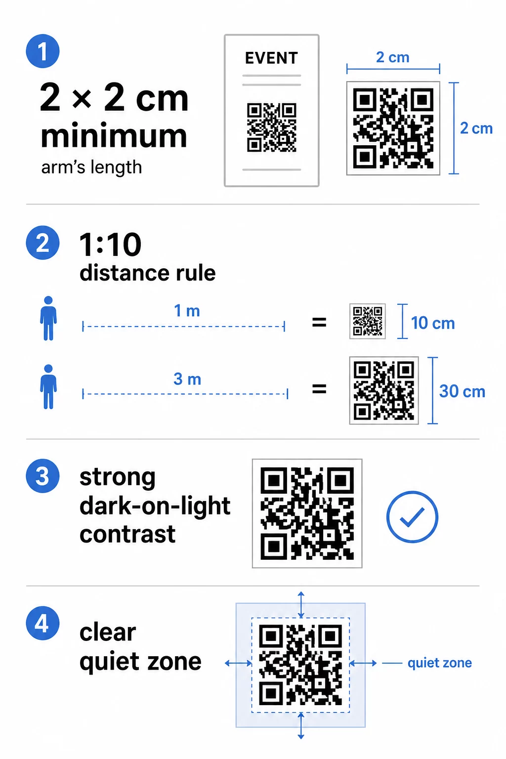
When designing posters intended to be viewed from further away – storefronts, hallway walls, trade show stands – follow the 1:10 sizing rule: for every 10 centimeters of scanning distance, the code should be 1 centimeter wide. A poster scanned from 1 meter away needs a code at least 10 cm wide; at 3 meters, that minimum rises to 30 cm. Always base your sizing decision on the distance of your closest likely viewers, not the average.
The QR code sizing guide for different print materials provides specific measurements for common poster formats so you can confirm your dimensions before sending files to print.
Contrast and Design Best Practices
Scanners decode a QR code by distinguishing dark modules from a light background. While traditional black-and-white codes are the most reliable, you can customize the appearance to match your branding – as long as you protect that distinction. Follow the QR code color contrast best practices and aim for a contrast ratio of at least 4.5:1 between the foreground modules and the background. Never invert the code by placing light modules on a dark background, as most scanners struggle to read this reliably.
Beyond color, the quiet zone is essential for recognition. This is the clear margin surrounding the code that separates the pattern from nearby text or graphics – think of it as a buffer that tells the scanner exactly where the code begins and ends. The quiet zone should be at least four modules wide on all sides.
Additional design guidelines to follow:
- Export in high-resolution vector formats such as SVG or EPS for print to prevent blurriness at larger sizes.
- Avoid gradients or shadows within the code modules, as mid-tones confuse scanner algorithms.
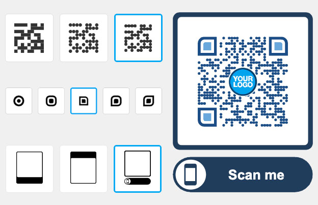
- If you add a logo, use a QR code generator with logo that manages error correction automatically, and keep the logo to no more than 30% of the pattern area.
- Choose matte paper finishes over glossy; gloss creates glare that reflects light back into the camera lens and blocks a clean read.
For a comprehensive checklist before going to print, the best practices for QR code readability covers additional technical checks worth running on your design file.
Ready to Track Your Scan Rates? Update destination URLs without reprinting a single poster. Use the QR Code Generator to create branded, trackable codes and manage your entire campaign from one dashboard.
Strategic Placement and Environment
Where the QR code sits on your poster matters as much as how it looks. Effective placement follows the natural line of sight. For most standing or wall-mounted posters, position the code between 3.5 and 5.5 feet from the ground – the range where viewers can comfortably raise their phone without crouching or stretching. Avoid placing codes at the very bottom of large-format posters or in corners where paper may curl or a frame may partially cover the quiet zone.
The surface and environment also affect scannability. Codes perform best on flat, smooth areas with consistent lighting. Curved surfaces – such as posters wrapped around pillars – distort the square proportions of the pattern and cause scan failures. Highly textured materials create similar problems. Harsh shadows, flickering lights, or direct glare prevent the camera from focusing cleanly, so consider the ambient lighting of your installation site before finalizing placement.
The ultimate guide to QR code placement in marketing goes deeper on environment-specific considerations, and the common QR code placement mistakes guide is worth reviewing before you finalize your layout.
Choosing Between Static and Dynamic Codes
When printing posters, the choice between static and dynamic codes has a direct impact on long-term cost and flexibility. Static codes embed the destination URL directly into the pattern. Once printed, that destination cannot change. If the link breaks, the event ends, or you want to redirect traffic to a new page, the poster is obsolete.
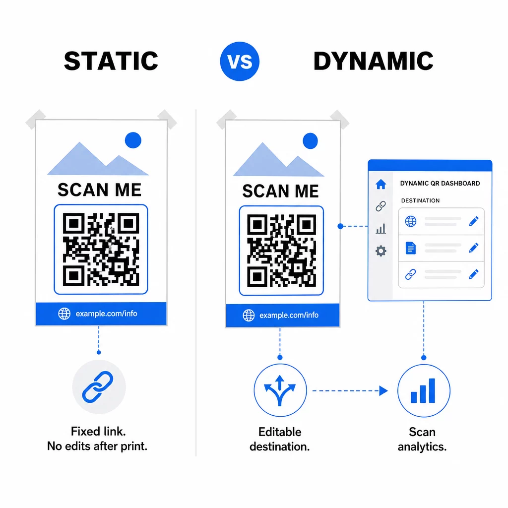
Dynamic codes use a short redirect URL, which means the underlying destination can be updated at any time through your dashboard – no reprinting required. Here is how the two options compare:
| Feature | Static Code | Dynamic Code |
|---|---|---|
| Destination editable after print | No | Yes |
| Real-time scan analytics | No | Yes |
| Pattern density | Higher | Lower (easier to scan) |
| A/B testing capability | No | Yes |
| Cost after printing | None | Subscription required |
For any poster campaign where content may change or where you need to measure ROI, dynamic codes are the practical choice. You can track total scans, geographic location, device types, and conversion rates from a centralized dashboard. Reviewing the differences between static and dynamic QR codes will help you decide which model fits your campaign timeline and budget.
Once a viewer scans your poster, the landing page they reach is just as important as the code itself. The mobile QR code landing pages best practices guide covers how to build pages that convert on a small screen.
Start Measuring What Your Posters Deliver Turn every print run into a source of campaign data. Use the link-to-QR code generator to create a dynamic code, then track scans by location, time, and device – without touching the printer again.
By applying the right size, contrast, placement, and code type, you can turn a printed poster into a measurable digital touchpoint that works long after the ink dries.
Frequently Asked Questions
Size depends on how far away viewers will be when they scan. Use the 1:10 rule: the code should be 1 cm wide for every 10 cm of scanning distance. For a poster scanned from 1 meter away, that means at least 10 cm wide. For close-up scanning at arm’s length, keep it no smaller than 2 × 2 cm (0.8 × 0.8 inches).
Yes, but contrast is non-negotiable. Always use a dark color for the modules and a light color for the background, and maintain a contrast ratio of at least 4.5:1. Never reverse this by placing light modules on a dark background, as most scanners will fail to read it reliably.
The most common causes are insufficient contrast between modules and background, a missing or too-narrow quiet zone, glare from glossy paper, or a code that is too small for the scanning distance. Test your printed code under the same lighting conditions your audience will encounter, and verify that the quiet zone is at least four modules wide on every side.


